Super Sticky – The navigation remains fixed at the top as you scroll.
Full-width Mega Menu – Expands across the entire width of the page.
Mobile Friendly – Works seamlessly on all screen sizes.
No Coding Required – Uses records and category settings to configure the menu.
Built on the Lionheart 2 Template – Simply copy and paste the provided code to integrate this menu.
Step 1: Account Setup
Before setting up the Mega Menu, ensure you have the following configured in your account:
Use the Lionheart 2.0 Template – This menu is designed specifically for this template. Please see the support notes below if you are not using Lionheart2.
Create a structured category system – Your store should have at least two levels of categories and subcategories.
Assign images and descriptions – While not required, adding an image and description to each top-level category enhances the menu’s appearance.
Set the subcategory display depth – Navigate to Ecommerce > UI Settings > Additional Settings. Set Subcategory Display Depth to 1.
Optional: Disable the Mega Menu dropdown
If you prefer a simpler header style without dropdowns, set the Subcategory Display Depth to 0 in the UI Settings.
This will remove the dropdown but retain the Mega Menu's styling.
Next, to implement the Mega Menu, you’ll need to copy and paste code into three specific areas: the Home Page Layout, the Default Layout, and the CSS Override.
Click on any image to enlarge.
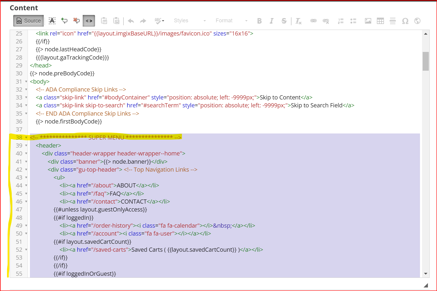
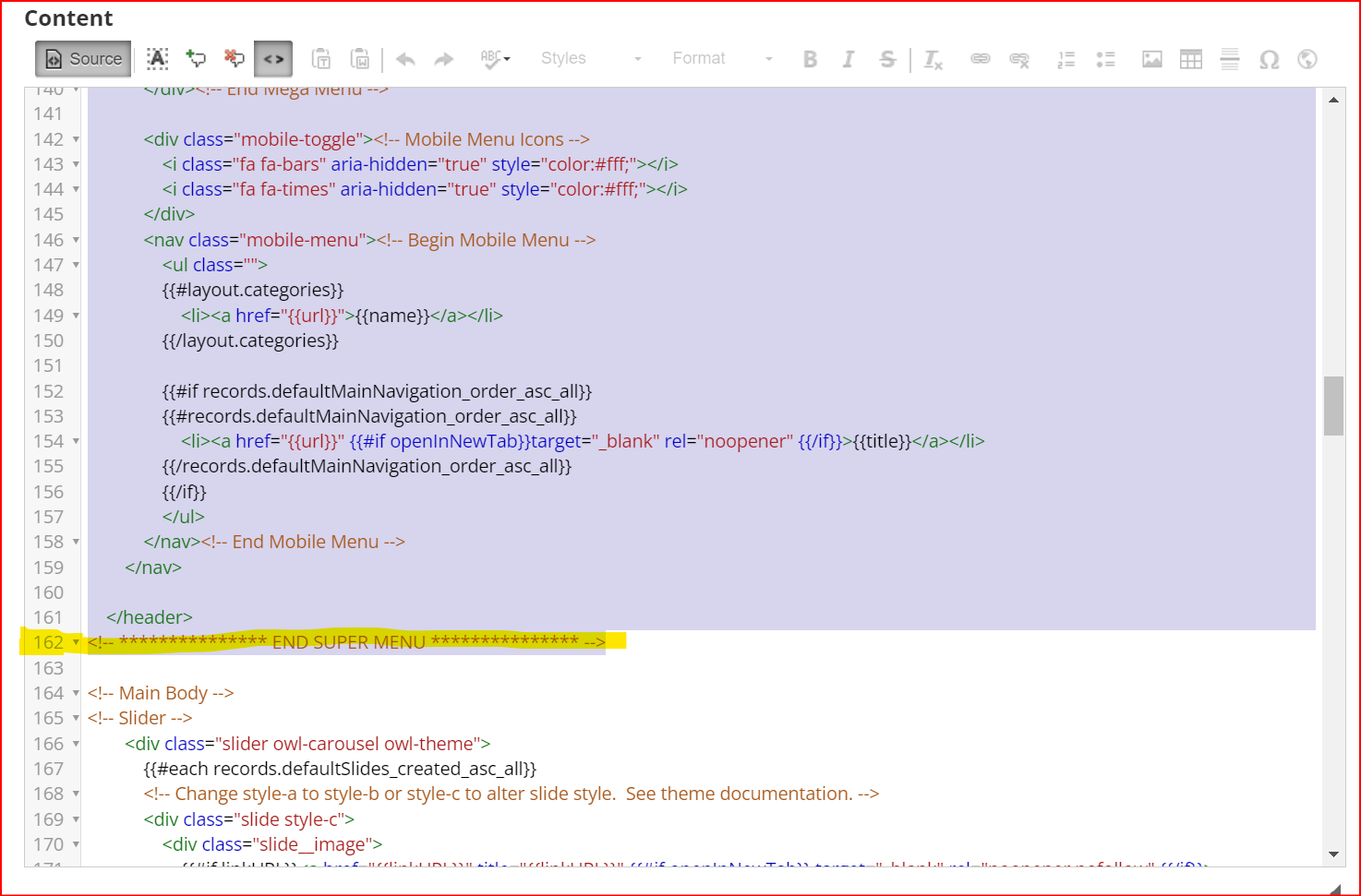
Step 2: Copy and Paste the Home Page Layout
Always Make a Backup! Before making any changes, back up any existing custom code: Copy the current code into a plain-text editor (such as Notepad or VS Code). Save the file to ensure you can restore it if needed. While you can revert to the default layout, any customizations will be lost, so it’s best to have a backup.
In Liftoff, navigate to: Website > Layouts > Homepage Layout
Locate the following line using your browser’s search function (Ctrl + F) on PC, (Cmd + F) on a Mac:
Once found, select everything below it until you reach: <!-- Main Body -->
Replace the selected section with the Super Menu markup from above.
Click on any image to enlarge.Click on any image to enlarge.
Home Page Layout Javascript
Copy the JavaScript Sections Below:
Search (Ctrl + F) for this line: <script src="/js/v1.0.0.18565a.liftoff.js"></script>
Paste the new scripts directly BELOW this line (do not remove it).
You'll need to manually type: <script> Then, paste the copied scripts from the buttons below. Close the script with: </script>
If you're copying both scripts, you will do this process twice.
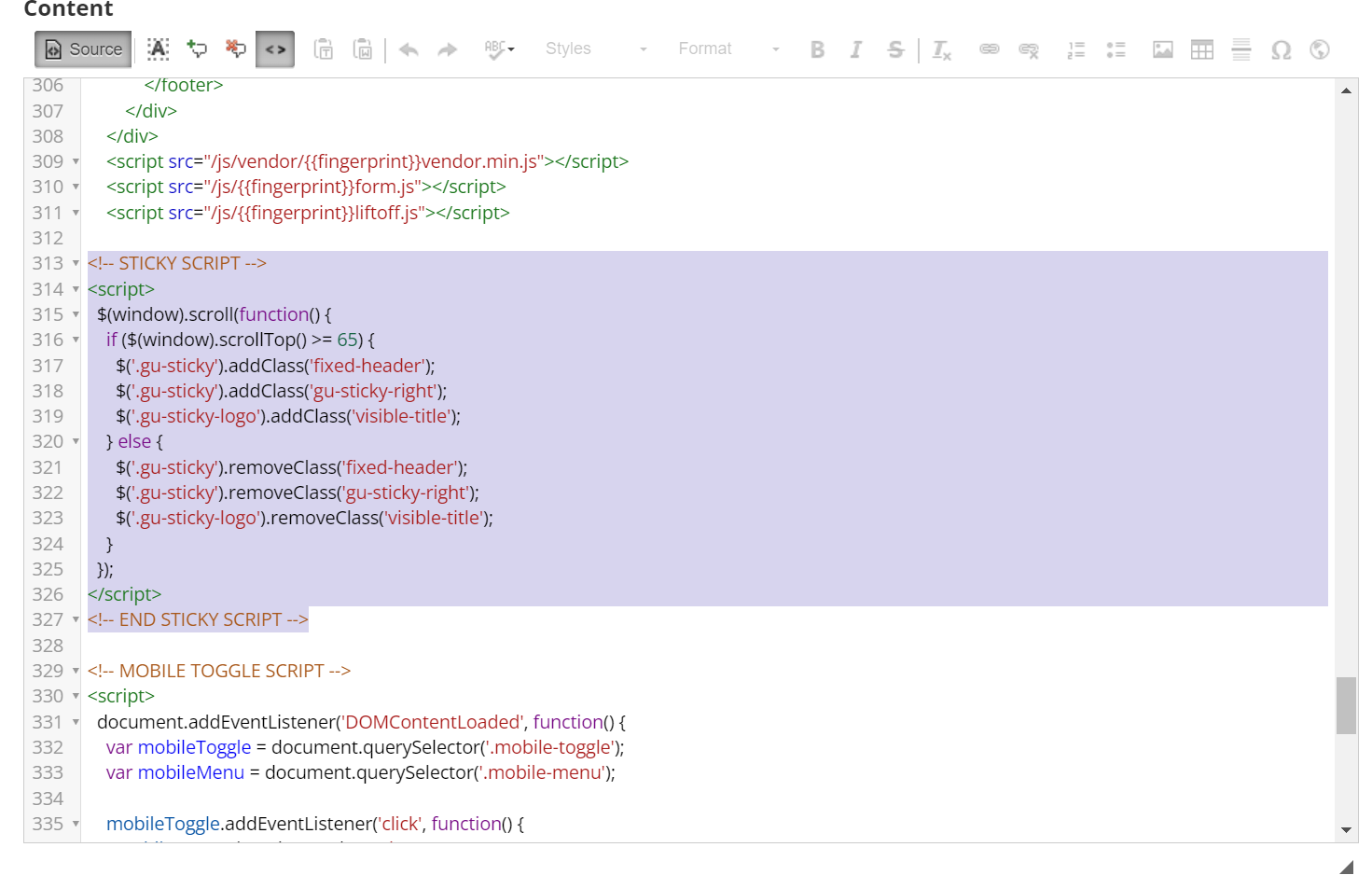
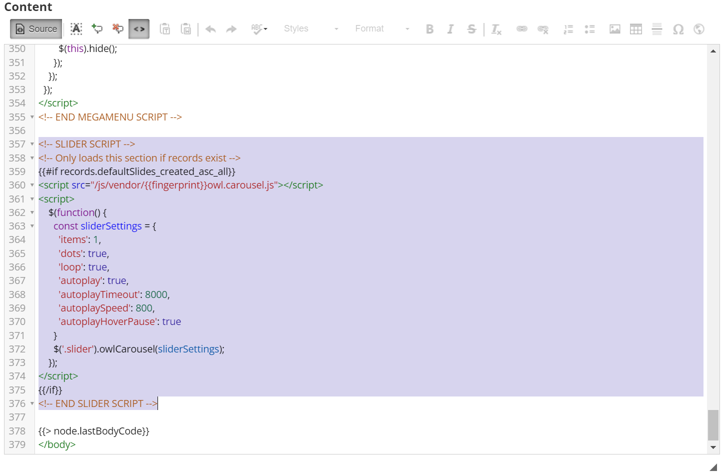
You'll find 2 sections of Javascript needed for this menu: one for making it sticky (Sticky Script), and one for making the menu responsive on mobile devices (Mobile Script). You should always copy the mobile script so that it adapts to smaller screen sizes seamlessly. However, the Sticky script is entirely optional. If you don't want the menu to stay "stuck" to the top of the window, just leave that script out.
Sticky ScriptMobile Script
- AND/OR -
Step 3: Copy and Paste the Default Template
Repeat the steps above on the Default Template.
Navigate to Website > Content > Default Layout
Find the markup and replace the relevant sections, including the scripts.
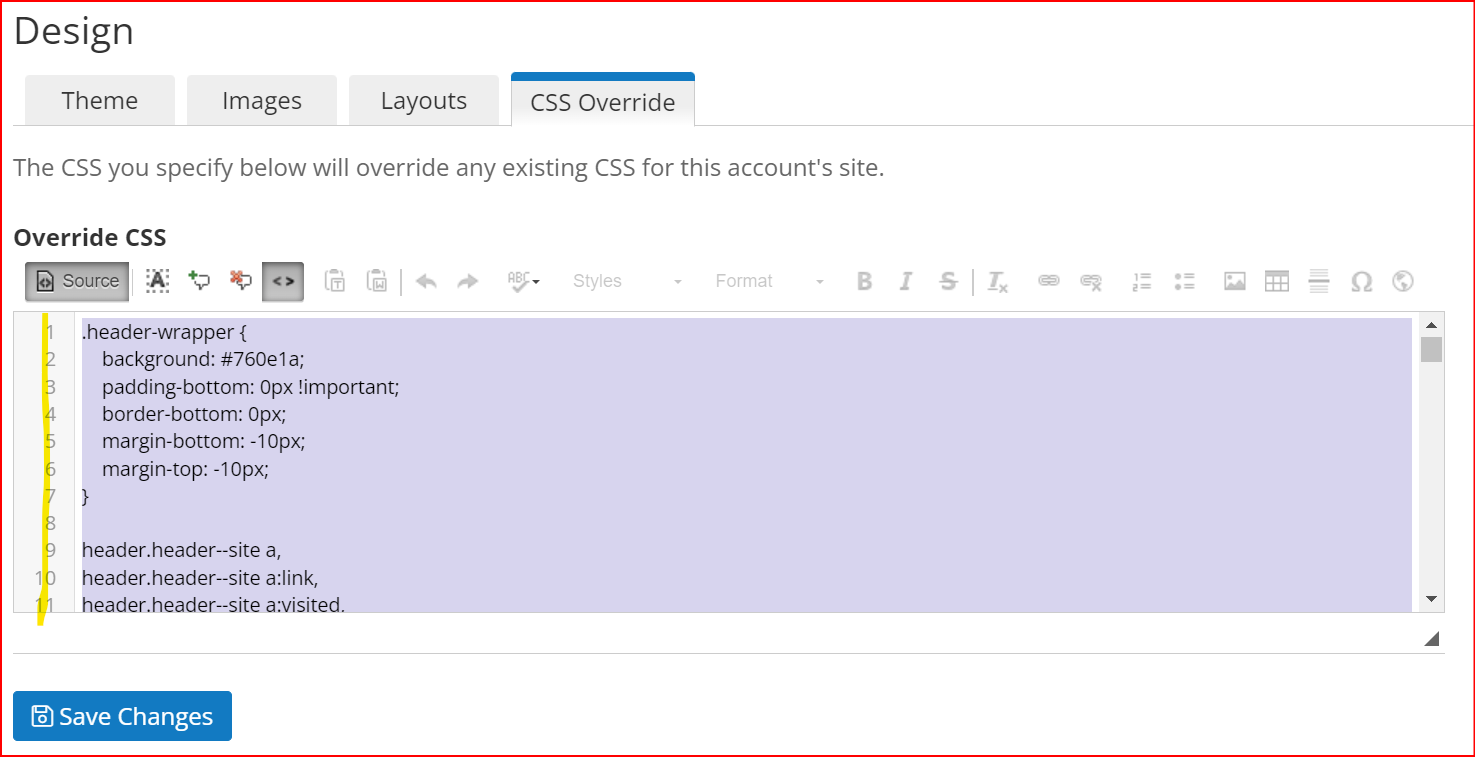
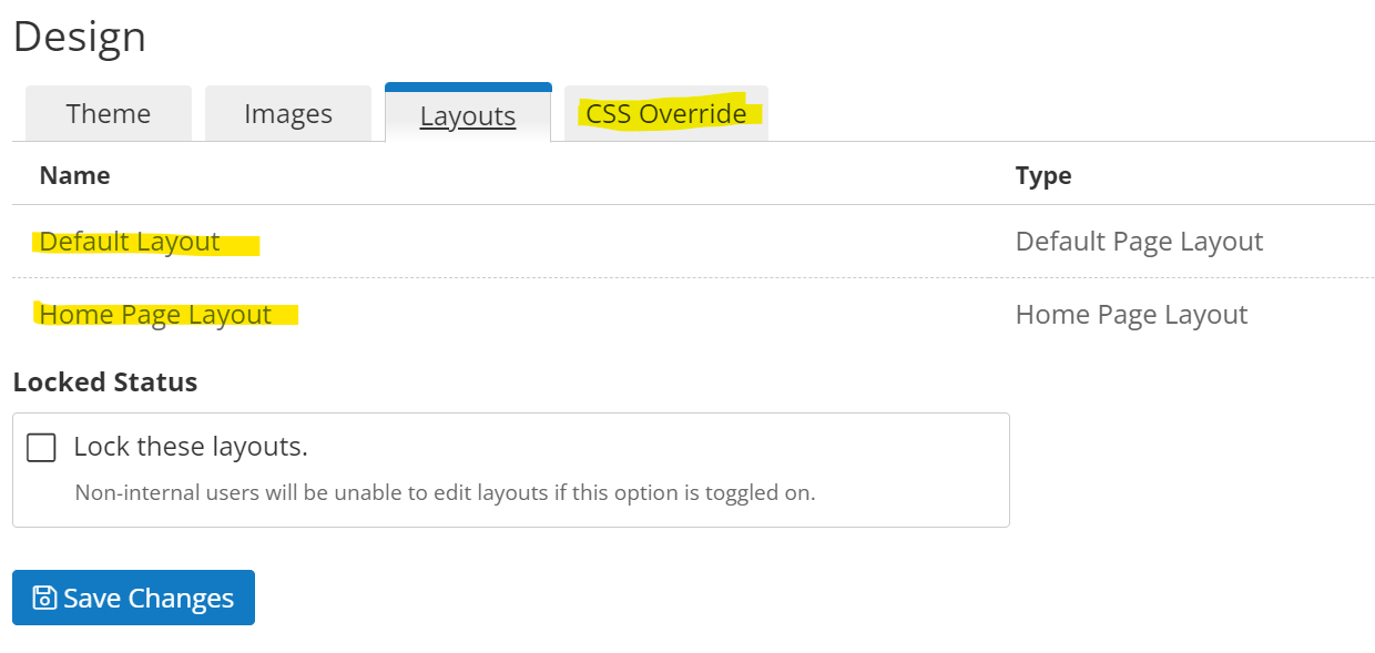
Step 4: Copy and Paste the CSS Override
Copy the CSS Override section entirely.
Paste it into the CSS Override of your account. You should paste it after any styles that already exist. If you have existing customizations it is possible something could conflict with the above markup which would require investigation. If you do not have an IT department or developer on your team, feel free to reach out to projects@liftoffcommerce.com and we can provide a quote to implement this header on your store, navigating any existing markup and ensuring everything is integrated as expected.
Adjust the Color Variables in the CSS to match your brand colors. There are 2 variables for each color section, the background and the text. Remember to alternate light and dark for legibility. For example, dark text against a light background, or light text against a dark background. In this demo example, the Top Navigation Bar is the black background and white text, the Main Menu is the white background and black text, and the Highlight color is a light blue. The Megamenu CSS has the variables in the very top section for easy identification and the variables are named and described. If you need any help identifying any part of the code for customization or need further instructions or clarification, feel free to reach out for assistance.